|
|
Post by [MJH] on Feb 4, 2008 8:12:17 GMT -5
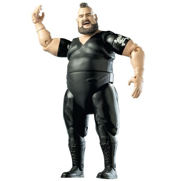
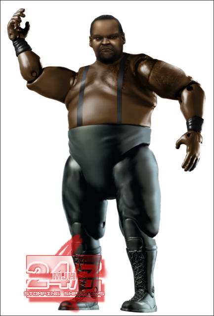 ...and an updated Hornswoggle 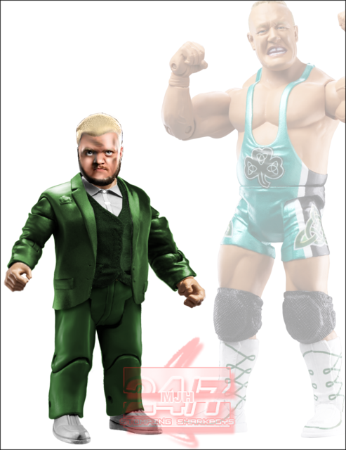 |
|
|
|
Post by Gazza on Feb 4, 2008 8:16:45 GMT -5
The attire and tattos on the BDV are awesome.
The Hornswoggle looks great aswell.
|
|
great1
Main Eventer
 Greatness.
Joined on: Jan 18, 2006 8:07:52 GMT -5
Posts: 3,101
|
Post by great1 on Feb 4, 2008 9:53:05 GMT -5
Maybe it's my computer screen but I had to bring it into photoshop and lighten it up to make out any details.
|
|
|
|
Post by [MJH] on Feb 4, 2008 10:06:56 GMT -5
I think it must be your computer screen because it's fine on mine.
|
|
Deleted
Joined on: May 4, 2024 23:25:15 GMT -5
Posts: 0
|
Post by Deleted on Feb 4, 2008 11:45:59 GMT -5
Yeah i hear what G1 is saying BDV looks really Dark and blurry.
|
|
|
|
Post by [MJH] on Feb 4, 2008 12:05:39 GMT -5
well for me the BDV is fine but I brightened it up. If it's still too dark now I suggest adjusting your screen settings. 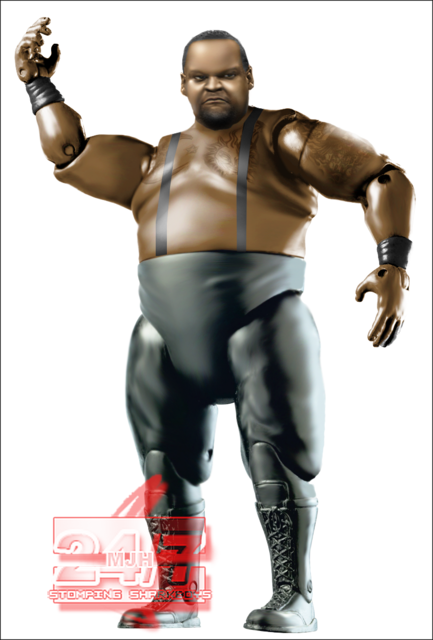 |
|
great1
Main Eventer
Greatness.
Joined on: Jan 18, 2006 8:07:52 GMT -5
Posts: 3,101
|
Post by great1 on Feb 4, 2008 12:18:47 GMT -5
That's a lot better, the tights and straps are a bit too light now but I can definatly see the face details and tattoos now.
I probably should adjust my monitor anyways though because I remember Bret saying that he could see Triple H's logo on my Brock Lesnar figure but it looked fine on my screen.
|
|
Nexus Leader
Superstar
Joined on: Jan 30, 2007 13:57:04 GMT -5
Posts: 861
|
Post by Nexus Leader on Feb 4, 2008 12:22:07 GMT -5
Yh i had the same problem as the Great1
i love the BDV. i think the torso is a great make and the tattoes look good, cause in real life thier not that much visable on his body and its just like taht. The only flaw is the head i think it mis shaped.
|
|
|
|
Post by greenjack1992 on Feb 4, 2008 15:41:07 GMT -5
Greatness.
|
|
|
|
Post by Kody on Feb 4, 2008 16:58:45 GMT -5
I agree it was too dark before. It's looks great now.
|
|
|
|
Post by ● kaneisdaman ● on Feb 5, 2008 6:32:01 GMT -5
Hornswoggle looks great. But a few things, his shoes need the green pattern also make the more hidden collar of his jacket similar to the exposed one. They are different styles currently.
As for BDV, I like that tat work but the shading is a bit extreme. I know it isnt screen issues or anything because the rest looks fine but the face and his left shoulder area could do with some light especially being near that stand out white light spot on his stomach side. Finally, BDV has strap like boots bot laced so it would be good if you could change that. Overall nice job, just a few things that could be fixed.
|
|
|
|
Post by [MJH] on Feb 5, 2008 6:49:09 GMT -5
 there's the original image, not much I could have done without losing loads of depth. |
|
|
|
Post by ● kaneisdaman ● on Feb 5, 2008 6:54:50 GMT -5
True but maybe you could have used another torso like that of Yokozuna.
|
|
|
|
Post by [MJH] on Feb 5, 2008 6:58:59 GMT -5
there weren't any other protos of that torso that are useable, if there were I'd have used em.
|
|
|
|
Post by ● kaneisdaman ● on Feb 5, 2008 7:16:01 GMT -5
There are protos of the fig available it is just a matter of photoshopping out the belt, that's what I did for it.
|
|
imdielawn
Main Eventer
watch.imdielawn.com
Joined on: Jul 16, 2003 10:42:29 GMT -5
Posts: 1,864
|
Post by imdielawn on Feb 5, 2008 8:39:23 GMT -5
The head isn't very good. The rest is not bad, but not good. It's too dark and contrasted around his shoulder, face is real burry and the darkness of the tats change too much. Not a fan of the straps either. I like the body on Hornswaggle.
|
|
|
|
Post by ringmarster1 on Feb 24, 2008 9:12:41 GMT -5
u know what i actually love that the face skin tone matches the bodys tone and the atire is done neatley
|
|
|
|
Post by BV on Feb 24, 2008 10:15:47 GMT -5
Stop topping old posts...Serriously
|
|


![[MJH] Avatar](http://i56.tinypic.com/5x3ote.jpg)