|
|
Post by brethitmanhart on Feb 8, 2008 17:34:38 GMT -5
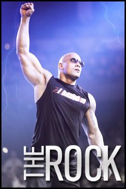
 I will edit it if anyone can think of anything to do to it. I like it I think the head matches wel with the torso and the lighting is the same. What do you think? |
|
|
|
Post by [MJH] on Feb 8, 2008 17:39:02 GMT -5
the tones are off and the cheeks look weird.
|
|
|
|
Post by brethitmanhart on Feb 8, 2008 17:41:04 GMT -5
I can see what you mean about the checks they need blending more but whats wrong with the tones? If the head too redish or yellowish?
|
|
|
|
Post by [MJH] on Feb 8, 2008 17:45:21 GMT -5
too redish and the body is slighty more coloured aswell
|
|
|
|
Post by brethitmanhart on Feb 8, 2008 17:47:50 GMT -5
Ok thanks I will edit it now. Also I started using PNG. file type and I have noticed it messes with the colour abit. It seems to lower the saturation and take out some colour. Edit: Any better?  |
|
|
|
Post by [MJH] on Feb 8, 2008 17:52:29 GMT -5
increase saturation in the head
|
|
|
|
Post by brethitmanhart on Feb 8, 2008 17:56:03 GMT -5
|
|
|
|
Post by [MJH] on Feb 8, 2008 17:59:24 GMT -5
better, still looks off though.
|
|
|
|
Post by brethitmanhart on Feb 8, 2008 18:06:44 GMT -5
OK, I'll try it now and I'm also gonna add sum black DA pads & Pink boots later.
|
|
great1
Main Eventer
 Greatness.
Joined on: Jan 18, 2006 8:07:52 GMT -5
Posts: 3,101
|
Post by great1 on Feb 8, 2008 20:08:47 GMT -5
Only suggestions I can think of is to lighten the area around the goatee and that one eye
|
|
|
|
Post by Cass on Feb 9, 2008 14:35:58 GMT -5
isnt it suppose to have hair?
|
|
|
|
Post by brethitmanhart on Feb 9, 2008 15:37:57 GMT -5
No, why?
|
|


![[MJH] Avatar](http://i56.tinypic.com/5x3ote.jpg)