|
|
Post by Valbroski on Jun 4, 2013 10:19:52 GMT -5
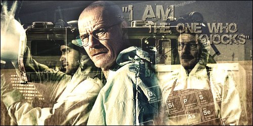 haven't done any of these in a while but I've been on a breaking bad kick again and wanted to make something. I feel like it could use more depth and the text definitely needs work but I figured I'd show you guys anyway. |
|
Deleted
Joined on: May 19, 2024 9:20:39 GMT -5
Posts: 0
|
Post by Deleted on Jun 12, 2013 23:06:58 GMT -5
It's not bad, but the text doesn't really fit with the whole theme of the show. Wouldn't mind seeing more work from you
|
|
PenguinDeluxe
Main Eventer
 20 Refs and Counting
Joined on: Dec 19, 2006 21:22:54 GMT -5
Posts: 4,932
|
Post by PenguinDeluxe on Jun 12, 2013 23:25:46 GMT -5
It's not bad, but the text doesn't really fit with the whole theme of the show. Wouldn't mind seeing more work from you How do you figure that? It's decayed, much like Walt's character throughout the show and many of the locations it takes place and the choice of line comes from one of the most memorable quotes. Fits pretty well if you ask me. |
|
|
|
Post by Valbroski on Jun 13, 2013 10:02:00 GMT -5
^ Not gonna lie, the text has no real tie in with the graphic. I just happened to be watching that episode while making it and had no idea for text, lol. I really dig how you're interpreting it though. I think this would of worked better as a larger graphic. I don't really make banners as much as I used to so working on that small amount of space again kind of makes it difficult.
|
|


