|
|
Post by skribbel24 on Aug 4, 2014 23:04:41 GMT -5
Attachment DeletedSo I made this while eating some snacks yesterday and posted it on my Instagram. Which logo is your favorite? I was always intrigued by V1 and V2 of the scratch logo. The "network" logo will still take some getting used to, and I wonder why they're taking so much time to finally use it. Are they hesitating?
|
|
|
|
Post by Mike Bockwinkel on Aug 4, 2014 23:34:54 GMT -5
|
|
|
|
Post by Kanenite on Aug 5, 2014 0:39:31 GMT -5
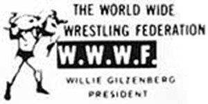
You forgot two of them  And the current "3D/Angled" one that has been the on screen bug since 2008 when they went HD. There is also two versions of the Network logo, the 3D one and the Flat one. |
|
|
|
Post by skribbel24 on Aug 5, 2014 2:47:35 GMT -5
You forgot two of them And the current "3D/Angled" one that has been the on screen bug since 2008 when they went HD. There is also two versions of the Network logo, the 3D one and the Flat one. Wow, I never saw this before. |
|
Too Sweet
Main Eventer
 R.I.P MJ
Joined on: Sept 20, 2006 23:28:07 GMT -5
Posts: 3,611
|
Post by Too Sweet on Aug 5, 2014 4:25:22 GMT -5
I like them all to be honest, but I got to go with the block logo that was introduced in the 80's, gradient aside it was a simple yet a bold and grand looking logo and I dug how the did subtle changes to extend the design such as different gradients and solid colors.
|
|
|
|
Post by LtD73 on Aug 5, 2014 4:30:01 GMT -5
New Generation logo is my favourite
|
|
Deleted
Joined on: Sept 28, 2024 16:51:10 GMT -5
Posts: 0
|
Post by Deleted on Aug 5, 2014 6:25:17 GMT -5
New Gen
|
|
Deleted
Joined on: Sept 28, 2024 16:51:10 GMT -5
Posts: 0
|
Post by Deleted on Aug 5, 2014 6:31:31 GMT -5
 I personally prefer the second to ever other logo. I just have never really cared much for the logos, and the newest one looks god awful. |
|
|
|
Post by Lord Ragnarok on Aug 5, 2014 6:43:55 GMT -5
Wasn't there one with the scratch logo over the block logo?
|
|
|
|
Post by The Kevstaaa on Aug 5, 2014 8:28:55 GMT -5
I'm all for the new one.
|
|
|
|
Post by Jonathan Karate on Aug 5, 2014 8:31:25 GMT -5
The block logo is the best.
Your missing a ton of them though.
I actually really like the original version of the new logo that was in WWE 13 and the original network commercials.
|
|
|
|
Post by BrIaNMeRcY on Aug 5, 2014 9:56:04 GMT -5
Wasn't there one with the scratch logo over the block logo? WWF Home Video  WWF Magazine  |
|
Deleted
Joined on: Sept 28, 2024 16:51:10 GMT -5
Posts: 0
|
Post by Deleted on Aug 5, 2014 9:58:09 GMT -5
I'm digging the new one like hell
|
|
Deleted
Joined on: Sept 28, 2024 16:51:10 GMT -5
Posts: 0
|
Post by Deleted on Aug 5, 2014 10:20:18 GMT -5
Its more weird to see the logo without the line under it. |
|
|
|
Post by sitruC on Aug 5, 2014 10:28:22 GMT -5
Any scratch logo.
|
|
|
|
Post by Jonathan Karate on Aug 5, 2014 10:40:27 GMT -5
Its more weird to see the logo without the line under it. Now that is one I've never seen before. Good eye. |
|
|
|
Post by Kanenite on Aug 5, 2014 10:54:11 GMT -5
And the Original version of that poster had the thick version of the scratch logo without the red line  |
|
|
|
Post by A-Rob on Aug 5, 2014 14:32:46 GMT -5
the original scratch logo was the best
|
|
|
|
Post by BrIaNMeRcY on Aug 5, 2014 14:34:59 GMT -5
As far as the scratch logo is concerned, it is said that Shane McMahon was the one who created it.
|
|
|
|
Post by Escape The Rules on Aug 5, 2014 15:02:27 GMT -5
WWE scratch logo.
|
|