|
|
Post by Valbroski on Jan 31, 2015 2:17:53 GMT -5
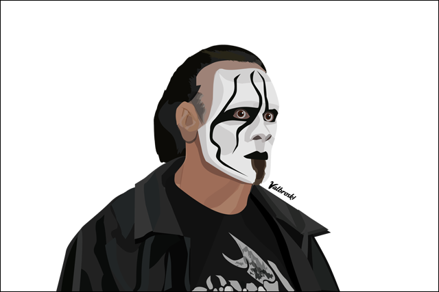  (ref pic) so I learned Illustrator in college but I haven't used it in probably a year. I've rarely ever done people in illustrator and was bored so I decided to take a stab at doing a wrestling vector. idk what made me want to try this but I had fun so I figured I'd share it. I need to get back into using illustrator anyway to work on my portfolio so I figured if anything this would be a way to get rid of the rust. Feel free to post thoughts/criticism. It's my first wrestling related vector art piece so I'm hoping there's room for improvement. Thanks for looking. also thanks to Lorenzo Alcazar for the reference pic, I got it from his sig. |
|
Deleted
Joined on: Jul 26, 2024 23:03:39 GMT -5
Posts: 0
|
Post by Deleted on Jan 31, 2015 9:12:16 GMT -5
That's awesome, very well done.
The one thing that jumps out is the hairline - I know it is actually receding so the accuracy is there but something just looks a little off, I think you may have gone a little too deep.
But from a technique and overall quality standpoint this looks great. I've tried playing around in Illustrator but never got the hang of it, looking forward to seeing more of your work.
|
|
|
|
Post by Valbroski on Jan 31, 2015 10:00:23 GMT -5
That's awesome, very well done. The one thing that jumps out is the hairline - I know it is actually receding so the accuracy is there but something just looks a little off, I think you may have gone a little too deep. But from a technique and overall quality standpoint this looks great. I've tried playing around in Illustrator but never got the hang of it, looking forward to seeing more of your work. I think it's too flat in comparison to everything else. It's kind of an awkward angle pic with the lighting and shadows so it was hard to color match. Probably gonna have to read up on some tutorials to get better at doing skin. Illustrator is confusing going into. They have these drawing pads you can use instead of using a mouse for the pen tool but the problem is when you go that route there's too many anchor points in the lines and it becomes a bitch to edit. I've seen some really crazy crap get made in illustrator using gradient meshes so I'd love to get a. Better handle on that. But yeah thanks for the feedback man. I definitely want to try doing more wrestlers and tv characters so I'll definitely post me as I make them. |
|
Deleted
Joined on: Jul 26, 2024 23:03:39 GMT -5
Posts: 0
|
Post by Deleted on Feb 15, 2015 16:10:21 GMT -5
wow how do u do that i wonna do it
|
|


