|
|
Post by Colter on Feb 8, 2015 9:04:39 GMT -5
Yeah, it's pretty bad.
|
|
|
|
Post by Midnight on Feb 8, 2015 9:42:04 GMT -5
My only problem with the figure is the fact that it is so short.
Ambrose is about 6'4 and this figure's scale is as if he was 5'10
|
|
|
|
Post by marino13 on Feb 8, 2015 10:10:22 GMT -5
I was okay with the goofy scan. I was content with the baggy pants. I could accept the skinny torso. But once I put him on my shelf and saw how tiny he looked I could not let it slide. My enthusiasm went right out the door. I hope and pray that... This is a quick turn Dean Ambrose just to get a first post Shield out. Hoping basic 51 is better than this |
|
|
|
Post by FWE on Feb 8, 2015 10:48:30 GMT -5
This is a quick turn Dean Ambrose just to get a first post Shield out. Hoping basic 51 is better than this its gotta be.. cant wait for toyfair if they have basic 51 photos |
|
|
|
Post by punksnotdead on Feb 8, 2015 10:52:19 GMT -5
What? posted a picture of that head on the E31 figure with the Cody vest and I think it looked damn good. If the scale was correct on the figure and they didn't just repaint a Hunico I think people would have been much happier with it. I do agree that the messy hair molding was a bit of a swing and a miss but the scan itself looks just like him imo.
|
|
Deleted
Joined on: Nov 16, 2024 19:39:59 GMT -5
Posts: 0
|
Post by Deleted on Feb 8, 2015 10:56:06 GMT -5
This figure could have been greatly improved if the shirt was moulded on. Why didn't they just use the old Shield Ambrose torso?
|
|
jacguitarist
Main Eventer
   
Joined on: Jul 24, 2007 18:26:49 GMT -5
Posts: 1,446
|
Post by jacguitarist on Feb 8, 2015 15:49:11 GMT -5
I honestly like the head scan. I think it is a tad small, which was probably done on purpose to look right on that size body. I did a few paint fix ups...the white dots for the eyes, I touched up his hair where the lines weren't exactly clean, and I painted his lips (which once done looks waaaay better
Before hand it's kinda hard to figure out what's going on with his mouth, but afterwards you can see the expression they were going for). Lastly, I did a light gloss for his hair to represent the wet look.
The body is short though, I will admit that. I'm sure the elite will be fine once it's here
|
|
|
|
Post by Chewdeezy on Feb 8, 2015 16:00:49 GMT -5
Mattel was just lazy with this attempt.
|
|
Deleted
Joined on: Nov 16, 2024 19:39:59 GMT -5
Posts: 0
|
Post by Deleted on Feb 8, 2015 16:54:38 GMT -5
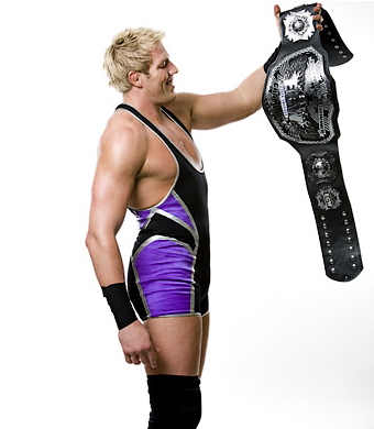
Basic 2 Jack Swagger is far from bad. its terrible, it looks like zack morris |
|
Deleted
Joined on: Nov 16, 2024 19:39:59 GMT -5
Posts: 0
|
Post by Deleted on Feb 8, 2015 16:56:23 GMT -5
Basic 2 Jack Swagger is far from bad. its terrible, it looks like zack morris I think it's a perfect representation of Jack Swagger from 2009 and the best Swagger head to date. |
|
Deleted
Joined on: Nov 16, 2024 19:39:59 GMT -5
Posts: 0
|
Post by Deleted on Feb 8, 2015 16:59:28 GMT -5
its terrible, it looks like zack morris I think it's a perfect representation of Jack Swagger from 2009 and the best Swagger head to date. he has a faux hawk, it doesn't resemble him at all imo  by default this is the least bad swagger head  |
|
Deleted
Joined on: Nov 16, 2024 19:39:59 GMT -5
Posts: 0
|
Post by Deleted on Feb 8, 2015 17:02:31 GMT -5
I think it's a perfect representation of Jack Swagger from 2009 and the best Swagger head to date. he has a faux hawk, it doesn't resemble him at all imo  by default this is the least bad swagger head  That other head isn't very good. He looks sleepy. And plus, Jack Swagger had a fauxhawk in 2009.  |
|


