|
|
Post by extreme on Jan 11, 2007 0:42:33 GMT -5
not my best work but eh... it works for the time being
|
|
Danny
Main Eventer

Joined on: Oct 2, 2006 13:46:27 GMT -5
Posts: 3,718
|
Post by Danny on Jan 11, 2007 16:34:28 GMT -5
Pretty Decent.
It just needs a border and better text.
|
|
|
|
Post by extreme on Jan 11, 2007 18:55:21 GMT -5
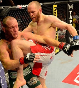
Pretty Decent. It just needs a border and better text. There is a border only that the banner is black and the border is black also |
|
|
|
Post by Cass on Jan 11, 2007 19:10:33 GMT -5
it has good blending, especially the part with the flag thingy on the guys face, it blends good. The bad side of the blending the guy on the lefts arm going through the middle guys head, it just doesnt look right. Has good colors and as styles said it needs a better text, but keep the same color for the text as it looks good. the 1px border looks good enough for a border because a bigger board i think would take away from the graphic itself, and im not to much liking how much the bg are blurred, it is just a little too much. but a pretty good sig none the less, you did a good job just fix thoughs few things
-cass
|
|