|
|
Post by Cass on Jan 25, 2007 16:56:28 GMT -5
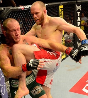
was for a gfx battle on another fourm enjoy er  |
|
|
|
Post by Mr. PerpetuaLynch Motion on Jan 25, 2007 17:28:29 GMT -5
Everything is good cept that odd glow around Trips. The font soots the graphic and the brush work looks pretty good. Take that glow off ad it would be a solid graphic... 6.9/10
|
|
Danny
Main Eventer

Joined on: Oct 2, 2006 13:46:27 GMT -5
Posts: 3,718
|
Post by Danny on Jan 25, 2007 18:38:23 GMT -5
things I like-
black and white
border
affects blending
things I dislike
-text
-stroke/outer glow around trips
blurry pic(right top side)
and don't worry, I know I will vote for you. not mega..
|
|
SystemofaDan
Main Eventer
Joined on: Nov 17, 2006 11:42:48 GMT -5
Posts: 2,397
|
Post by SystemofaDan on Jan 26, 2007 17:19:08 GMT -5
I like the Glow around HHH, Well Done
10/10
|
|
|
|
Post by classicfan on Jan 26, 2007 20:46:10 GMT -5
It isn't your best work man. You haven't put out something even close to what your capable of, in a while. (7-10)
|
|