|
|
Post by 1wrestlinassociat1 on Mar 28, 2007 2:33:51 GMT -5
this is harder than i thought   advice is appreciated |
|
|
|
Post by ThrowinUpTheX on Mar 28, 2007 10:24:25 GMT -5
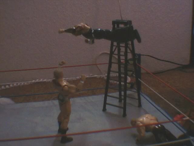
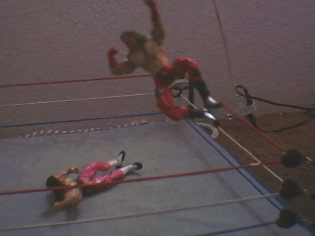
Hi, they're alright tbh could be better. Firstly the string needs to be edited in some way paint/photoshop, Secondly you need a light or something over the ring so you can see the poses better. The 2nd pose is better than the 1st as hbk's positioning is very good and bret's reaction could of been better. 1st pose just doesn't appeal to me and i honestly don't really like it. Sam
1st Pose: 5/10
2nd pose: 7/10
|
|
|
|
Post by ThrowinUpTheX on Mar 28, 2007 10:26:26 GMT -5
Sorry i just realised the string sorry, it was wires.
|
|
|
|
Post by f1gh7er on Mar 29, 2007 14:26:32 GMT -5
first: 4/10 i think jeff could have been better posed
second: 8.5/10 shaun is a little but to high and bret could have been a tiny little bit better
|
|
|
|
Post by waterfox on Mar 31, 2007 1:23:12 GMT -5
Great Job 7/10
|
|
|
|
Post by kencocoffee on Mar 31, 2007 4:06:13 GMT -5
first: 4/10 i think jeff could have been better posed second: 8.5/10 shaun is a little but to high and bret could have been a tiny little bit better STOP REPLYING YOU DICKHEAD. |
|
|
|
Post by skyfabio on Mar 31, 2007 4:22:06 GMT -5
1st pic is bad...Jeff is a bit stiff :\... 4/10
2nd pic is good....Micheals position is almost perfect....8/10
|
|


