Deleted
Joined on: May 16, 2024 11:46:43 GMT -5
Posts: 0
|
Post by Deleted on Jul 7, 2008 16:03:01 GMT -5
 1988-1993; 1995-1997 Logo 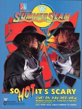 1994 Variation Logo  1998-1999 Logo (99 version didn't have the SS behind the name)  2000 "Yellow and Blue" Logo  2001-2004 "Green and Blue Thin" Logo  2005 "Silver Font" Logo  2006-2007 "Green and Blue Thick Font" Logo (2007 version was brighter)  2008 Logo Wikipedia is a godsend lol. |
|
|
|
Post by v/\v on Jul 7, 2008 16:05:02 GMT -5
2000 for me, it's perfect.
|
|
|
|
Post by Kody on Jul 7, 2008 16:06:57 GMT -5
I really like this year's.
|
|
|
|
Post by ericbischoff on Jul 7, 2008 16:08:11 GMT -5
2006-2007 "Green and Blue Thick Font" Logo for me, its looks cool
|
|
|
|
Post by Hammersmith Hardman on Jul 7, 2008 16:09:53 GMT -5
2000 for me, it's perfect. |
|
|
|
Post by khalicantwrestle on Jul 7, 2008 17:27:40 GMT -5
The 2005 one sucked
For me, 2000
|
|
|
|
Post by Groundswell on Jul 7, 2008 17:41:23 GMT -5
2000 was godly.
|
|
|
|
Post by Chicago on Jul 7, 2008 17:58:20 GMT -5
2006-2007, or the early 90s SummerSlam logo.
|
|
|
|
Post by Heresy on Jul 7, 2008 18:05:37 GMT -5
2008 looks blurry like it's just a rehashed logo that's been messed around with on paint it.
98-99 is nasty.
|
|